Her kullanıcısına özel bonus bettilt fırsatları sunan sektörün en avantajlı sitesidir.
Bahis deneyiminizi daha eğlenceli hale getiren bettilt her zaman günceldir.
Kumarhane eğlencesini dijital dünyaya taşıyan pinco bölümünde her zevke hitap eden seçenekler mevcut.
Oyuncular hızlı erişim sağlamak için bettilt adresini kullanıyor.
Finansal güvenliği ön planda tutan bahsegel politikaları memnuniyet sağlıyor.
2024 yılında yapılan bir analiz, kullanıcıların %77’sinin mobil bildirim kampanyalarını değerlendirdiğini göstermiştir; bahsegel giriş bu sistemi aktif kullanır.
Gerçek casino atmosferini hissetmek isteyenler bahsegel seçeneklerine yöneliyor.
Hızlı erişim sağlayan pinco uygulaması büyük kolaylık sunuyor.
Bahis sektöründe global bir marka haline gelen bettilt yenilikleriyle dikkat çekiyor.
Online oyun deneyimini tamamen farklı bir bahsegel giriş boyuta taşıyan, hem yeni başlayanlar hem profesyoneller için mükemmel bir tercih sunuyor.
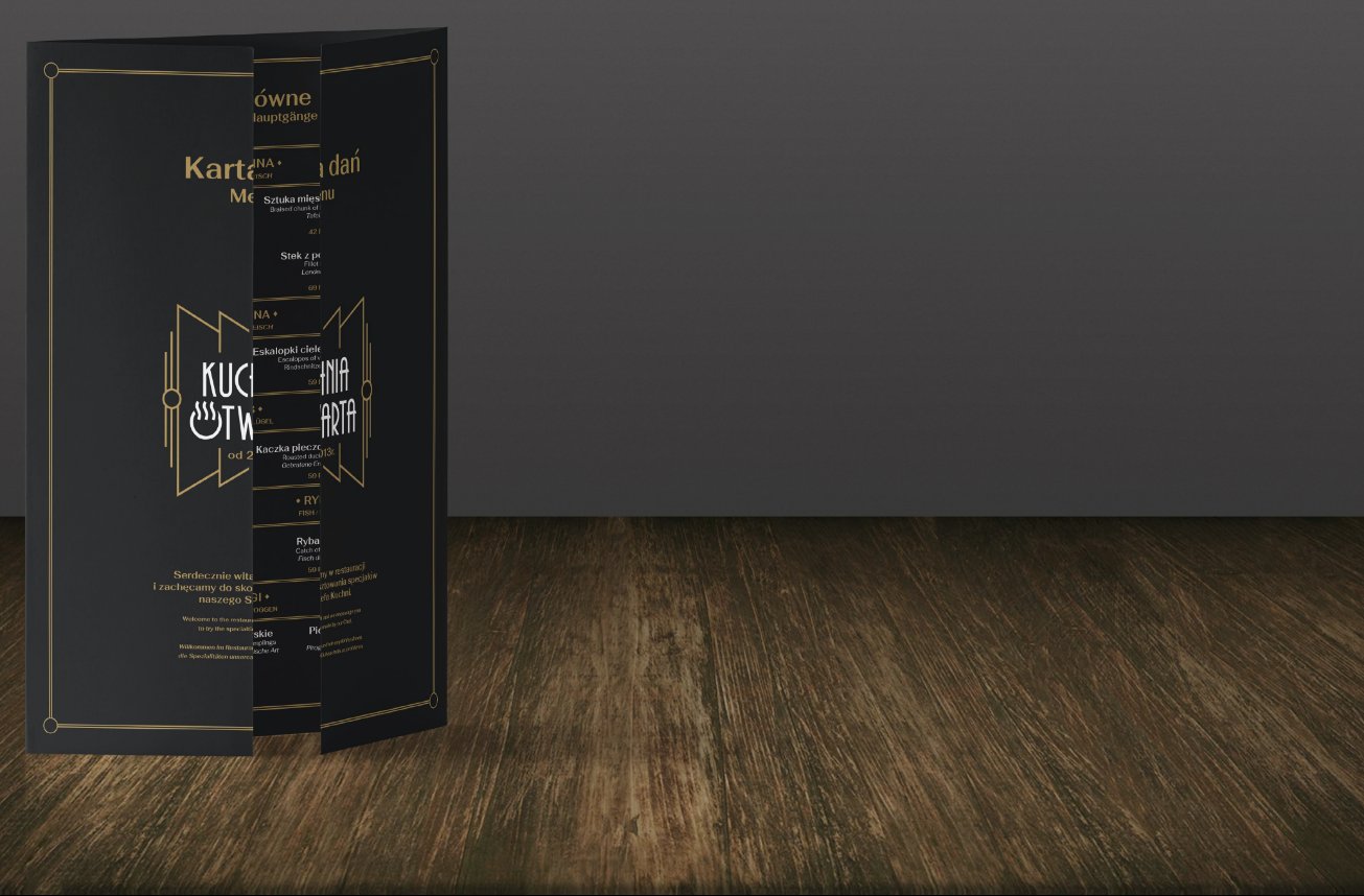
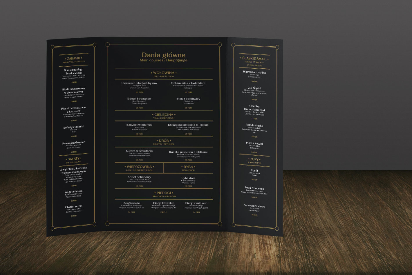
Designing a logo and identification for a restaurant in Katowice
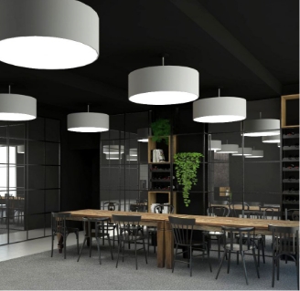
A unique Katowice restaurant with a view of the guest kitchen.
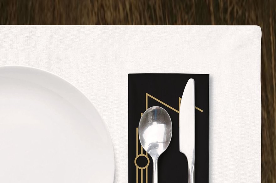
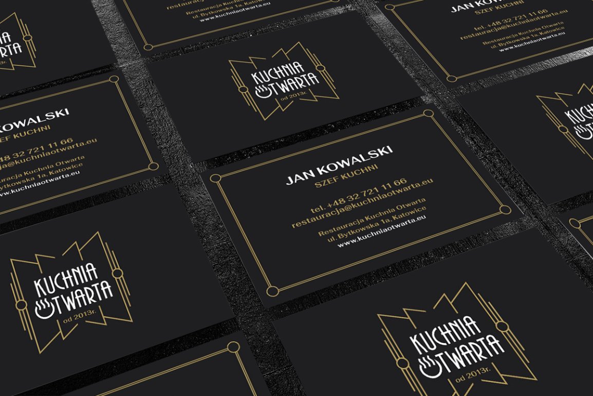
We have developed the concept of a new logo and the basic elements of the restaurant’s image. The aim of these activities was to create a coherent image of the restaurant, combining modernity and tradition, and then presenting these qualities in a visual form. It was important to emphasise the characteristics that distinguish the restaurant from its competition (open kitchen, French service). The materials that we create are to serve the brand of the restaurant and represent it for many years. The concept has not been fully implemented.
The concept has not been implemented.
Target image
Assumptions about brand attributes
Openness
interwar
kitchen
tradition
modern twist
elegance
smell
art deco
Symbols
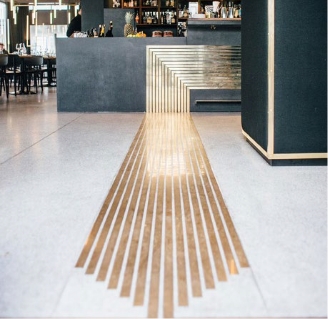
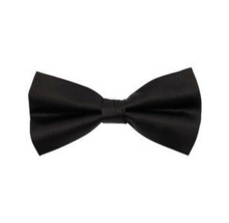
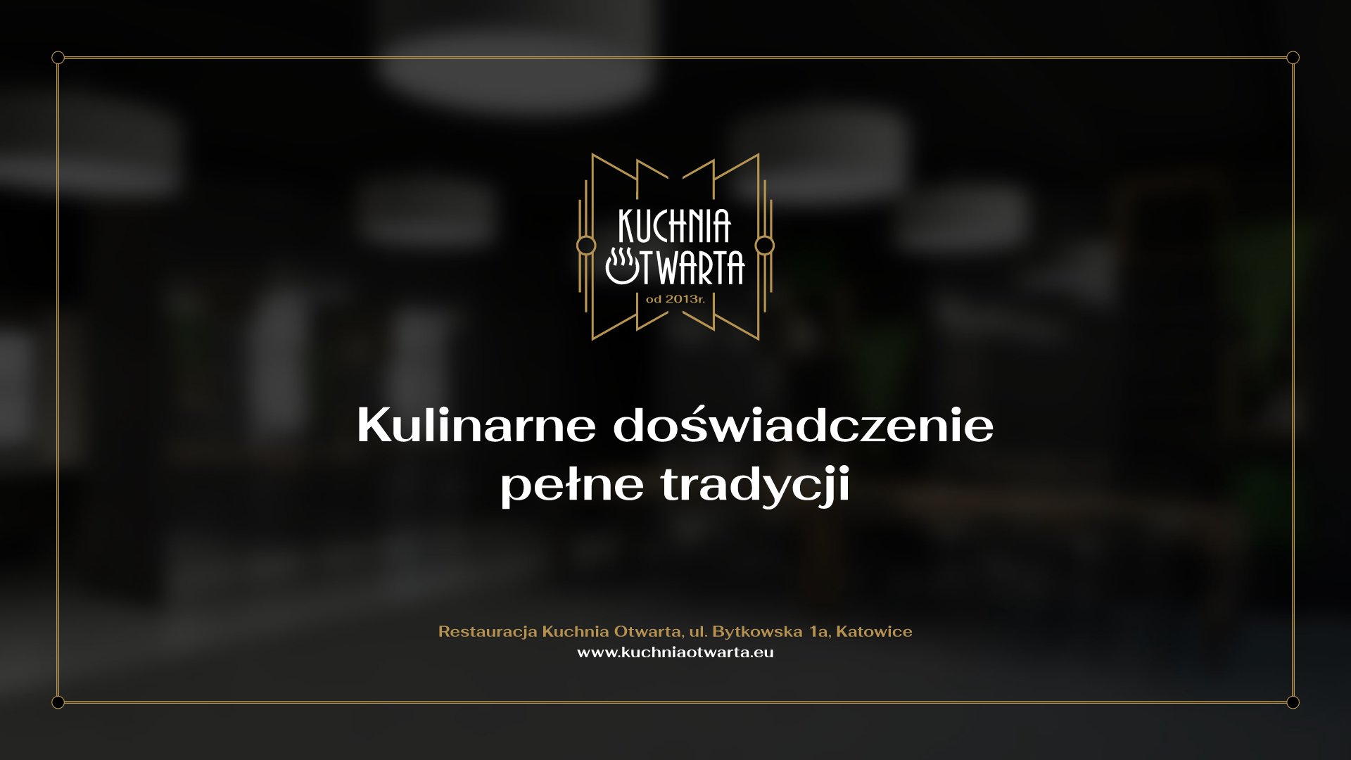
The graphic sign was based on shapes that refer to a wide-open door, which is obviously a direct reference to the openness of the kitchen – the restaurant’s distinguishing feature. The form naturally emphasises the name of the restaurant.ally makes the image coherent.
At the same time it brings to mind the shape of a bow tie that the waiters are to wear, which addition
Stylistics
In accordance with the guidelines, the graphic sign was based on the Art Deco style that reigned in the interwar period. The style is very characteristic, which will enable the recipients to identify a restaurant with interwar cuisine and the symbolism it offers.
Typography
The tailored writing form refers to the Art Deco style aforementioned and perfectly matches the previously described refreshed concept of the restaurant.
An additional graphic element inscribed in the letter “O” enriches the sign with a reference to the plate and the aroma of the dish floating above it, thanks to which the visual message is complete.
Thanks to contrasting the color of the name and the graphic elements, the logo gains legibility.